Choosing Bathroom Color

Choosing a color for the bathroom and its design is not so simple, because bathroom is a very personal place. It should be comfortable and beautiful. To achieve beauty you can try using different colors.
The most popular color for the bathroom is white. White is simple and elegant. The white tends to show any contamination, which will help keep the bathroom impeccably clean, because you’ll always see where the dirt is. One of the interesting properties of white is that it “reflects” heat, which means that on a cold winter morning is no more suitable color for the bathroom, than white.
Black is just the opposite. It hides most of the dirt, but it “absorbs” heat. There is another problem in black bathroom interior. The color tends to make things seem smaller than they really are, a dark bathroom will seem cramped and small.
Green is a popular color, which relaxes and soothes. It gives rest not only the body but also the soul. This color is reminiscent of nature. Dark-green in the bathroom gives the feeling that you’re in deep woods or are in groves of paradise.
Blue is also a very popular color, and it has even more profound relaxing effect than green. Using the blue in the bathroom design in different shades, you will feel calm and appeasement. Blue makes people think about the oceans and water, and this is a wonderful feeling to help you relax and rest.
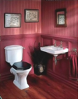 If you wake up early and you do not want your bath to relax you, and vice versa, you need some kind of jolt in the morning. Then you will want to decorate your bathroom in the red color or its derivatives. But do not overdo it, as bright red is depressing. Still, for most baths it is better to use derivatives of soft colors. In the morning the color will cheer you a little, but at night will not stop the desire to return to bed.
Monochromatic colors, i.e., shades of the same color can have different effects on the state and mood. Typically, these colors are soothing and relaxing, but can quickly become boring and dull due to lack of vitality and color contrast.
The combinations of colors that are close in spectral table are good for bathroom interior. Using two or three colors related to each other captures all the attention and brings harmony and depth. There is one problem with this type of colors. Sometimes inadvertently adding a fourth color can ruin the whole design.
The combinations of opposite colors are welcome. Warm colors, combined with cool colors such as yellow and purple, red and green, or blue and orange, create an interesting combination. They are also visually pleasant for most people. Because the two colors contain all three primary colors, color scheme is full and well balanced.
